
|
Objectives: 1. Students will create two flyers that applies domain knowledge in Graphic Design to a school activity. 2. Students will explain who their "clients" are, who their "target audience" is and what their layout and composition techniques are.
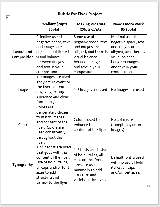
Step 1: Watch this video:Step 2: Answer the question in the comments section: Step 3: Begin planning your flyer by filling out the planning sheet. You can download by clicking here.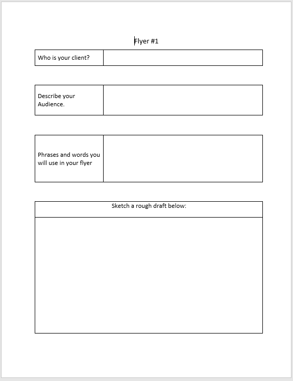 Step 4: Begin and complete your Flyer on PowerPoint or Word after Mr. Vela has approved your flyer. Click here for Mr. Vela's logo design videos to help you with PowerPoint design.Flyer Rubric |
 |  |
Step 5: Submit your flyer by uploading and sharing your work on Office 365, One Drive. Watch the video below for help on uploading and sharing on Office 365.
Phillip bautista
9/22/2017 08:17:39 am
i think that this video is good i like watching it it is interesting.
Eder
9/22/2017 08:21:23 am
i think it is good for us because it show us how it wroks
Daniel Yang
9/22/2017 08:16:09 am
I will use white space for my flyer. This will help my work to be not clutter and looking nice.
Devin Douangmala
9/22/2017 08:16:38 am
I will apply the technique of white space on a flyer. This is the space between the visual and textual content, it helps the reader be more organized and less cluttered.
jordan ladd
9/22/2017 08:16:42 am
I will use the techniech of contrast. I like this because I want to catch someone's eye.
Ying Moua
9/22/2017 08:17:32 am
I learned that when you make a flyer you need to space out the writing, use different fonts, use different colors, and use different sizes
isaiah almendarez
9/22/2017 08:17:39 am
I LIKED it,it was good it help me understand it more clearly
makala sisty
9/22/2017 08:17:42 am
I lrnba abot witet spasa.
John Blancas
9/22/2017 08:18:30 am
this is good i would wany to do this
Jasmine Landa Per 1
9/22/2017 08:18:43 am
Something that I want to do in my flyer is contrast.It makes the reader more interested and fun.
andrew
9/22/2017 08:20:11 am
it was interesting
Jeremiah Colasanti
9/22/2017 08:20:19 am
White space can help define and separate I will use it for my flyer.
ERIC VILLARRIAL
9/22/2017 08:20:21 am
it was good
buikjn
9/22/2017 08:20:31 am
I will contrast in my flyer
Ailani felix
9/22/2017 08:20:34 am
This video is good and its also telling us how to use logos and how to lay it out.
joseph
9/22/2017 08:21:14 am
i will follow the graphic designer rules.
Mariah
9/22/2017 09:04:55 am
I knew what all of these thing were, but I didn't know what they were called. Hierarchy sounds pretty hard to remember. :)
Jack
9/22/2017 09:05:34 am
One thing that i learned in this video that I will put on this flyer is proximity.
Ryan Grossmann
9/22/2017 09:05:40 am
I would like to add white space to my flyer.
elijah holmes
9/22/2017 09:05:49 am
i haved learned that you need spacing and actraction
luis Ambriz
9/22/2017 09:05:51 am
one thing that I learned was that when we make a project we don't have to leave a lot of white space we can but a certain amount
Nick Machado
9/22/2017 09:05:52 am
I will use big letters to attract people.
Ayden
9/22/2017 09:07:05 am
I learned that you have to have something to catch someone's eye, like making the the letters big and bold.
Matthew Flores Jenkins
9/22/2017 09:07:08 am
Something new that i am going to put in my flyer is color and pictures and also spacing in between the section's.
KANDICE MOUA
9/22/2017 05:19:42 pm
BRUUHHHHH?!?!?!!!!?????!?!
Mariah
9/22/2017 09:07:24 am
I going to ad proximity.
Style
9/22/2017 09:07:39 am
You will apply white space like the space in between the words.
Josh
9/22/2017 09:07:49 am
I will apply white space to my flyer.This is the space you put between the things on your flyer so its not so cluttered.
Priscilla Jimenez
9/22/2017 09:08:01 am
One thing that i learned in the video is to make white spaces in your flyer.
Yuliana
9/22/2017 09:08:43 am
I will use color and adjust the size of things.
yunique gonzlaez
9/22/2017 09:15:27 am
i will use white space for my flyer.
Hezekiah
9/22/2017 11:41:56 am
I will put white space that it will have room and make ur design look nice.
Rhythm
9/22/2017 11:42:38 am
Something that I learned from the video that I think will really help is the "Hierarchy" stuff.
Mason Flores
9/22/2017 11:42:44 am
1 thing I learned to help my flyer is to always keep it steady and looking nice.
Marco Dominguez
9/22/2017 11:42:46 am
I learned what a white space is how to move and organize the thing so it can be clear to read.
Davina
9/22/2017 11:42:49 am
The thing I felt that will really help my flyer is proximity, since it helps you align things that should be grouped together so nothing will be mixed up and all a mess.
Sandra Ambriz
9/22/2017 11:42:55 am
One thing that I wanted to add to my flyer was the white spaces those would make my paper look more organized.
Calyce L
9/22/2017 11:43:00 am
I will "think like a designer"
Jude martin
9/22/2017 11:43:06 am
I will use contrast to make my flyer different and amazing.
Francisco
9/22/2017 11:43:08 am
I learned how much white space to use and how to put things in the center.
Pedro Castro
9/22/2017 11:43:09 am
I will use contrasting to edit my flyer by making the words pop out and details in the backround.
Alexis De Paz
9/22/2017 11:43:30 am
I'm going to add colors to my flyer and make spaces between it.
promise
9/22/2017 11:43:41 am
I learned about my spacing and how to get someones attention
Jacob Vorabouth
9/22/2017 11:43:59 am
I will put alignment to organize the concept neater. Also hierarchy is important to show the reader where to start at.
sunny D
9/22/2017 11:44:05 am
what ima use from the the video is get some thing that pops out
Zad
9/22/2017 11:44:15 am
One thing I learned is to control the size and the color of the text so I can control what the reader will focus and read first.
Ronaldo
9/22/2017 11:44:19 am
for my flyer I am going to put a lot of effort into it so i can get an A plus on my assignment
daniel
9/22/2017 11:44:27 am
one thing i have learned is that when make flyer there needs to be spacing it is very important because if its cramped together who gonna want it. it will look very messy it needs to look clean. i will use proximity or white space because it keeps it organizing so it make it look professional
miguel
9/22/2017 11:44:49 am
Color and the style of the writing can matter a lot like thh aliment of text as well.
nathaniel
9/22/2017 11:45:21 am
one thing i have learned from the video is that you need to give text space to breath
Isaiah
9/22/2017 11:45:33 am
I learned to put proximity
monique echeverria
9/22/2017 11:46:01 am
Monique - i think that spaces matters the most even if you don't have much to say you can space it out to look fuller
Adrian
9/22/2017 11:46:55 am
I will use the white space because it will help me with the flyer. It will help me by putting more space which makes it look neater
caleb castenon
9/22/2017 11:47:40 am
one thing i learned about the video and i will apply to my flyer is organizing my wok so it is not so messi and all over the place.
Andrew Glenn
9/22/2017 01:08:18 pm
i will use alignment because it makes the flyer look way better in my opinion
Mainly because i have o.c.d.
Gavin Bain
9/22/2017 01:11:26 pm
Mr.Vela i learned that color makes the text "pop" out more that just white and also i learned that text font also makes it more "enjoyable for you're eyes to look at"
chris ybarra
9/22/2017 01:11:31 pm
i learned that you can make alot of space for the text and bigger sizes
Evan Zavala
9/22/2017 01:11:38 pm
I will use something more eye catching so that they can read hat part first.
Christina Kountz
9/22/2017 01:11:44 pm
That...was......AWSOME!!!!!!
sunnie machado
9/22/2017 01:11:57 pm
how to make a cropping of the photo
KEVIN VUE
9/22/2017 01:12:12 pm
I will make a change for the white spaces that i have on my flyer.
Elijah Cochron
9/22/2017 01:12:14 pm
One thing that I will be applying is that details should be evenly spaced, and have the same color, shape, and font. This will help me because it keeps my work clean.
DAMIAN HERENANDEZ
9/22/2017 01:12:45 pm
I WILL USE BIG WORD TO ATTRACT PEOPLE
Jonathan r.
9/22/2017 01:13:03 pm
I will use alignment because as it says it will make things that are hard easy and also, it's consistent.
Adrian Moua
9/22/2017 01:13:12 pm
In my flyer I will space out my writing and Aline everything evenly.
James Rodriguez
9/22/2017 01:13:28 pm
I will use proximity white space and alignment I think these were the most important of all
jayla xiong
9/22/2017 01:14:02 pm
what I learned in this video is that when you make a flyer, you need to space out the writing, use different fonts, use different colors, and use different sizes for your flyer to look "perfessional."
dominic
9/22/2017 01:14:11 pm
that you need to line it up
ray
9/22/2017 01:14:24 pm
good job!!
Jordan Del Rio
9/22/2017 01:14:38 pm
One thing I learned in the video was hierarchy.
bobbyrobinson
9/22/2017 01:14:40 pm
you need spas to help
peopl need to
now
wut your no your idei
Tahjier jones
9/22/2017 01:14:46 pm
I have learned that having more time can help you pursue your dreams and learn how to type.
Sonny Martinez
9/22/2017 01:14:55 pm
One thing that I have learned about is contrast and I will apply it so that the reader could focus on the important thing of the flyer.
Kevin Carrillo
9/22/2017 01:14:57 pm
I have learned that using contrast is used to catch one another's attention, so I will be using more contrast in my flyer to catch other people's attention.
Alyssa
9/22/2017 01:15:04 pm
What I learned was the contrast and how it helps you with the dots. And it helps a lot.
Joshua Rodriguez
9/22/2017 01:15:36 pm
I learned that we have to use some space and using contrast will catch the attention of people
Mia Daddy
9/22/2017 01:15:38 pm
I learned that we should have a equal amount of white space and contrast can help something pop.
Anthony Ledesma :V
9/22/2017 01:15:42 pm
I learned to make the most important details bold bigger and make them stand out and make it nice with enough space.
Daniel Musso
9/22/2017 01:15:51 pm
It talked about the 5 rules to graphic design.
Noe Galindo
9/22/2017 01:16:12 pm
It was talking about spacing and contrasting.
Christina Kountz
9/22/2017 01:17:07 pm
sorry about my last comment. I learned about doing a flyer!
lorenzo aguilar
9/22/2017 01:17:21 pm
that as good
irene
9/22/2017 02:09:05 pm
this viedo is really good
Jack Meyer
9/22/2017 02:09:33 pm
I will use repetition to show the reader what the event is about.
Jesse
9/22/2017 02:11:43 pm
i learned about alignment and how it helps your presentation not be cluttered
SEBASTIAN GARCIA
9/22/2017 02:12:11 pm
The thing that I learned is the white space. The white space is how much space there is between your content.
Mariah
9/22/2017 02:12:31 pm
i learned about white space
Milagros Maldonado
9/22/2017 02:12:44 pm
One thing that I would put in my flyer is catching the readers eye . For example changing the fount of the text or putting pictures in the flyer.
Diana I.
9/22/2017 02:12:44 pm
The type of thing that makes curious is spacing. It help me and other people, for example: we want to look beautiful and we want to have an equal space for each info on a flyer. :D
Jonathan Serna Vidales
9/22/2017 02:13:02 pm
I will make mine with a lot of PAZAZ
nicholas gutierrez
9/22/2017 02:13:02 pm
i think it is good because it will help us learn what to do when we do it
Noah
9/22/2017 02:13:13 pm
I will put allinment on my flyrer.
Ethan
9/22/2017 02:13:52 pm
i learn to use white space in my flyer
Aiden
9/22/2017 02:13:54 pm
i can use white space so that people can understand it more
Ethan Harris
9/22/2017 02:14:57 pm
I will use PROXIMITY so that they can read the paper
angel
9/22/2017 02:24:51 pm
i learned about white space
princess sison
9/22/2017 09:02:00 pm
I learned that proximity is all about using visual space to show relationship on your on your content
angel vazquez
9/25/2017 09:34:47 am
in my flyer i will use alignment to make my flyer easier to read.
Francisco
9/25/2017 09:39:45 am
i learn to put proximily
David E.
9/25/2017 11:56:30 am
I learned alignment and white space.
Adrian ruiz
9/25/2017 01:23:30 pm
I learned about white space
KELLIN SMITH
9/25/2017 01:33:25 pm
White space is something that I am going to use in my flyer.
Omar
9/25/2017 02:21:21 pm
I Learned How to organize text
codycavanaugh
9/27/2017 01:09:22 pm
1.liked the video i think it was cool.
2.I think the video was helpful.
3.the video was so helpful eanouh i now know what to do
Comments are closed.